
Adjusting your monitor for image viewing.
This short article explains why you should adjust your computer monitor settings to view images online and gives a recommended range for brightness and contrast that should come really close to the brightness and contrast you'll see in an actual print of the image.
Why you should adjust your monitor to view images on your computer
If you've ever bought a print online, your first reaction upon seeing the actual print was probably "..it's darker than I expected" or "the colors are more muted than I expected."
There is a reason this happens (routinely), but know that the immediate perception of less brightness or contrast upon seeing a print is temporary. Your brain will shortly self-correct your initial perceptions and you'll enjoy the print's vibrancy and colors just as much as you did when you saw it online.
There are two reasons why the image you see online can appear brighter and/or more contrasty than the actual print.
1. By far, few of us ever adjust the settings on our computer monitors (including tablets and smartphones) after we bring them home. These devices all come with factory settings that create very bright and contrasty displays. Some displays automatically reduce brightness and/or contrast in low light conditions so you won't blow your eyes out when reading in bed with the room lights off, but revert to a brighter screen in normal situations. Engineers establish these settings for 'typical people' using them for 'typical uses' in 'typical settings.' Viewing art online is not a 'typical use' and art lovers are not 'typical people' (we're special)!
2. There is no way a print can mimic anything close to the levels of brightness and contrast you get from a computer monitor set at 100% brightness (~250 cd/m2) and/or typical contrast (~1000:1). Without getting too technical, the main reason for this situation is because computer monitors are viewed by backlighting and prints are viewed with reflected light from a non-white substrate. Reflected light is always less intense than backlight. Also, prints made on papers, metals, or any other substrate will never reflect 100% of the light falling on the substrate. Optically perfect mirrors come close to 100% reflection, but few of us make or buy prints printed on perfect mirrors, do we?
Recommended monitor settings
Luckily, there are ways to force your computer monitor to more closely mimic the brightness and contrast you'll see in an actual print. Once you make these adjustments, not only will the online image look more like an actual print, but you'll likely enjoy viewing images online much more, whether you buy a print or not. Overly bright monitors cause eye fatigue, wash out colors and tones, and in some, heighten a sense of stress or agitation. Who wants any of that when trying to enjoy art?
Most modern computer monitors let you adjust brightness, contrast, and even color hues to suit individual tastes. Typically, these settings can be adjusted from buttons on the front or side of the monitor. You may need to consult the user manual to find instructions for manually setting brightness and contrast.
Don't be surprised by the following recommendations as they are rather drastic. You may want to reject the recommendations at first, but if you give your viewing perceptions time to accommodate to the new settings, you'll quickly realize how much more enjoyable and accurate the new settings will make your viewing experience.
Use the image below to adjust your monitor's brightness and contrast using the room lighting you typically use. The goal is to see as many of the rectangles as possible, meaning your monitor is just bright enough and just contrasty enough to see fine shadows and delicate highlights in the images you view.
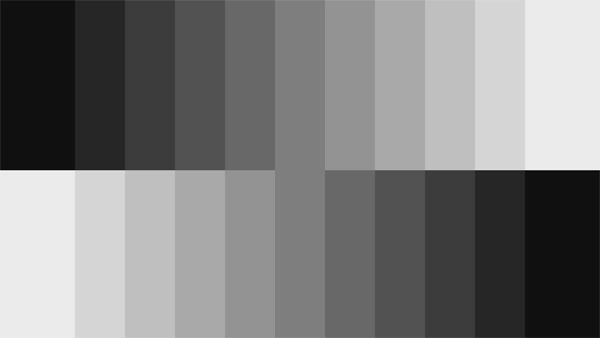
As reference only, my monitor is set to Brightness = 78% and Contrast = 38% and I can see all 14 steps. Your monitor settings will likely be different.
If your monitor comes with presets instead of scales, use one that suggests settings for "Movies" or "Theater" as they will come closest to the recommended manual settings.
You can always change the settings back to 'factory' settings or something more modest if you find that your personal uses demand more brightness and/or contrast, but give these a try first. Keep in mind, however, that the farther you get from the recommended settings, the more what you see on the monitor will differ from what you see in an actual print of the same image.
What about color settings? Well, color settings vary widely across modern monitors. Many have begun introducing "Blue-light reduction" modes, which automatically add more yellow light to the display. This might be great for saving us from the danger of blue light, but it does little to give us accurate real-life colors we see in actual prints. And short of monitor calibration techniques, which requires separate equipment and calibration profiles, it's very difficult to manage colors on most monitors. Just keep in mind that colors seen on a computer monitor are typically much more vibrant than colors on an actual print, when viewed side by side. Our recommendation is to leave color settings at factory defaults unless you're prepared to buy the equipment to properly calibrate your monitor.
Take these steps and see if they don't make a difference in your online viewing pleasure. At the very least, if contemplating buying a print you see online, adjust monitor brightness and contrast before ordering to get a much better idea for what the actual print will look like. Again, though, once you get your print, realize that any surprises you feel when first seeing the print's brightness, vibrancy, and tones will diminish in time as your brain accustoms itself to appreciate the inherent qualities in the actual print, and you will love it just as much as you did when first seeing it online.